
CoinChange
//
CoinChange //
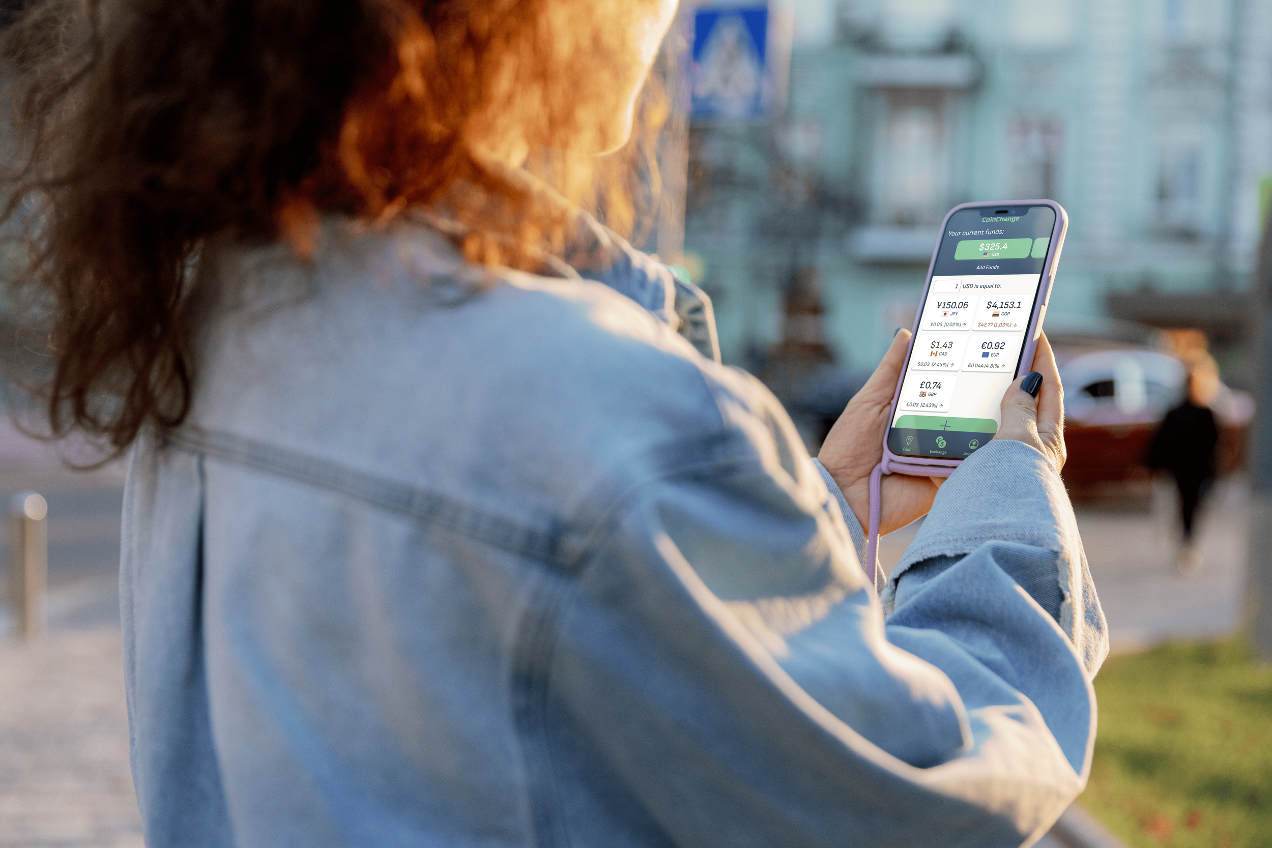
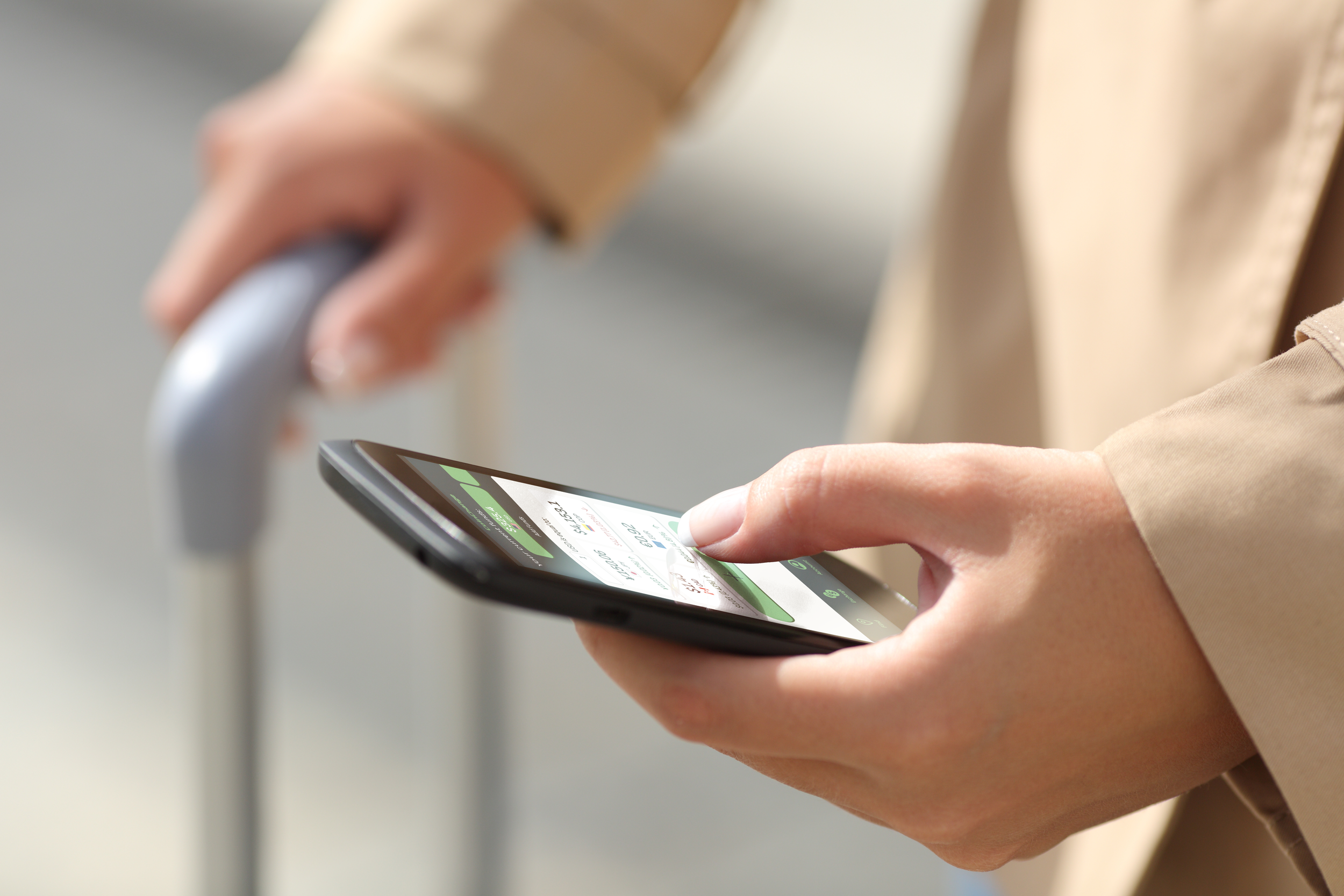
A UX/UI project focused on the design of a currency exchange app and responsive website. CoinChangeis a solution that simplifies currency exchange for money-conscious travelers. While exchange rates abroad often cause confusion and stress, physical agencies remain vital for local discovery. To bridge this gap, a native mobile app and responsive website that provide total transparency were designed. By prioritizing trust, CoinChange balances digital efficiency with physical exploration, ensuring users find fair rates while engaging authentically with their destination.
Time: 2 months
//
Team: Solo
//
Google UX Design Certificate
UX Research
UX Design
Prototyping
FIgma
My Role:
The Challenge
Finding a reliable exchange agency during trip preparations or while navigating a foreign country can be an incredibly stressful and taxing experience for travelers. The lack of transparency regarding fluctuating rates and hidden fees often makes it difficult to calculate exactly how much local currency is required, leading to confusion and financial vulnerability. This strenuous process is further complicated by the struggle to determine what constitutes a "fair" rate in an unfamiliar market. Consequently, users often feel forced to choose between the convenience of high-fee digital options and the uncertainty of seeking out physical agencies that both offer cultural discovery and a streamlined approach, but lack clear, upfront pricing.
Which is why it was asked:
How might we design an app and a responsive website that quickly showcases the different exchange rates between currencies, shows the current rates and location of local agencies and offer its own exchange service?
The Solution
CoinChange is a service that seeks to help frequent and money conscious travellers manage, understand and exchange different currencies. CoinChange´s goal is to make exchanging money easy, transparent, and convenient.

Research
After a series of user interviews and a competitive audit, it was discovered that users feel unsure and stressed when finding a place where to exchange currencies during their travels due to not only the difficulty of finding a fair exchange rate, but also finding an agency near their vicinity. This was only exacerbated because users could not find a unified place to find all the information they needed, which resulted in either time consuming research or a reliance on pure luck.
Exchange agencies have varying exchange rates between different currencies, rates which are often unadvertised or difficult to find.
Local exchange agencies don't always offer exchange services for certain currencies, which makes looking for an agency with the desired exchange a difficult, often luck based process.
When traveling to another country, figuring out how much money you might need can be confusing as its difficult to quantify how much purchasing power a given currency has.
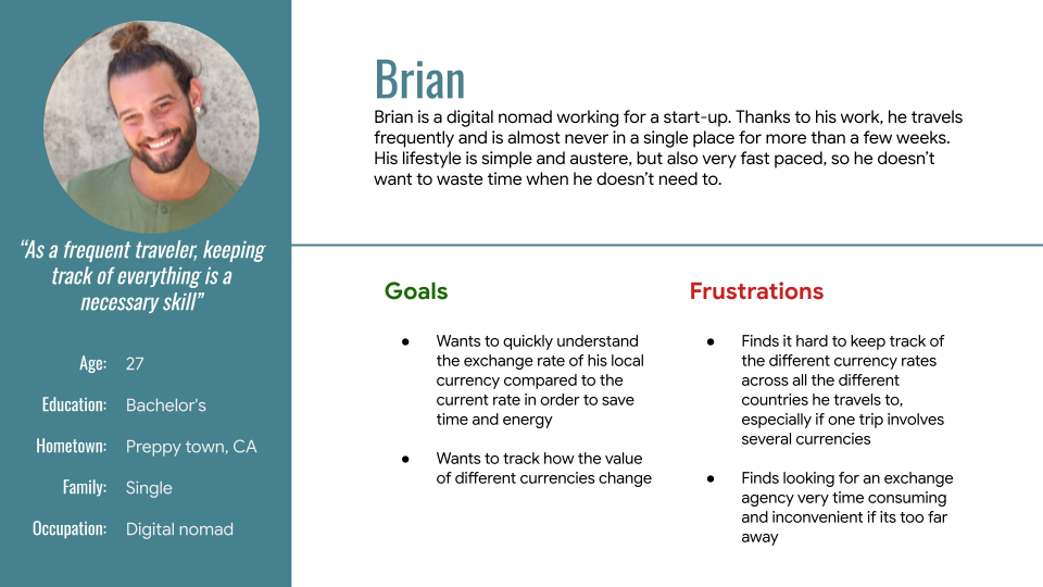
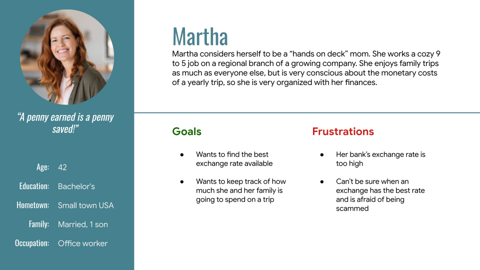
User Personas
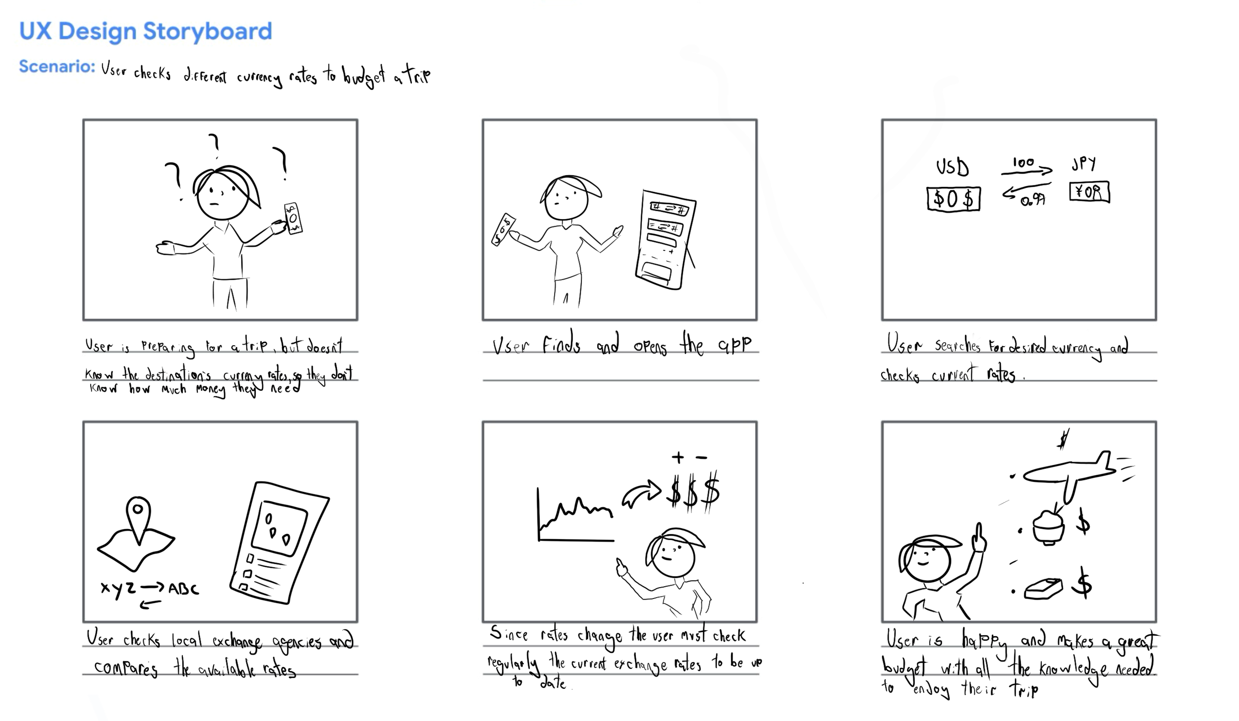
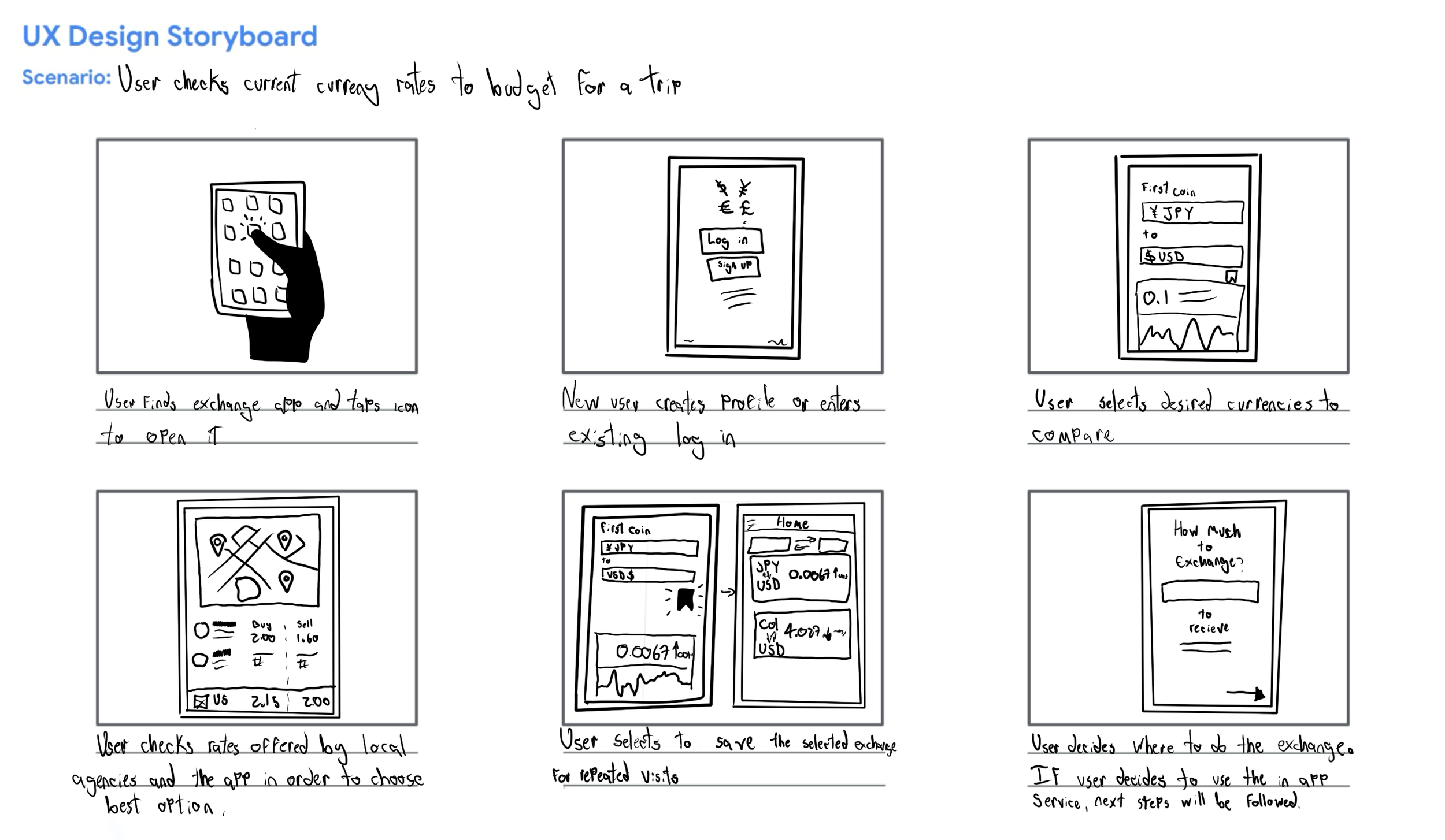
Storyboards
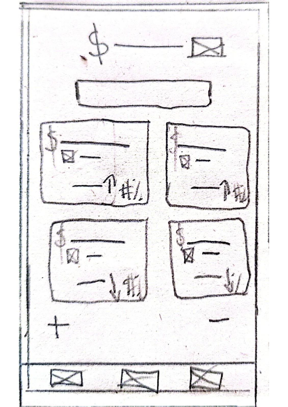
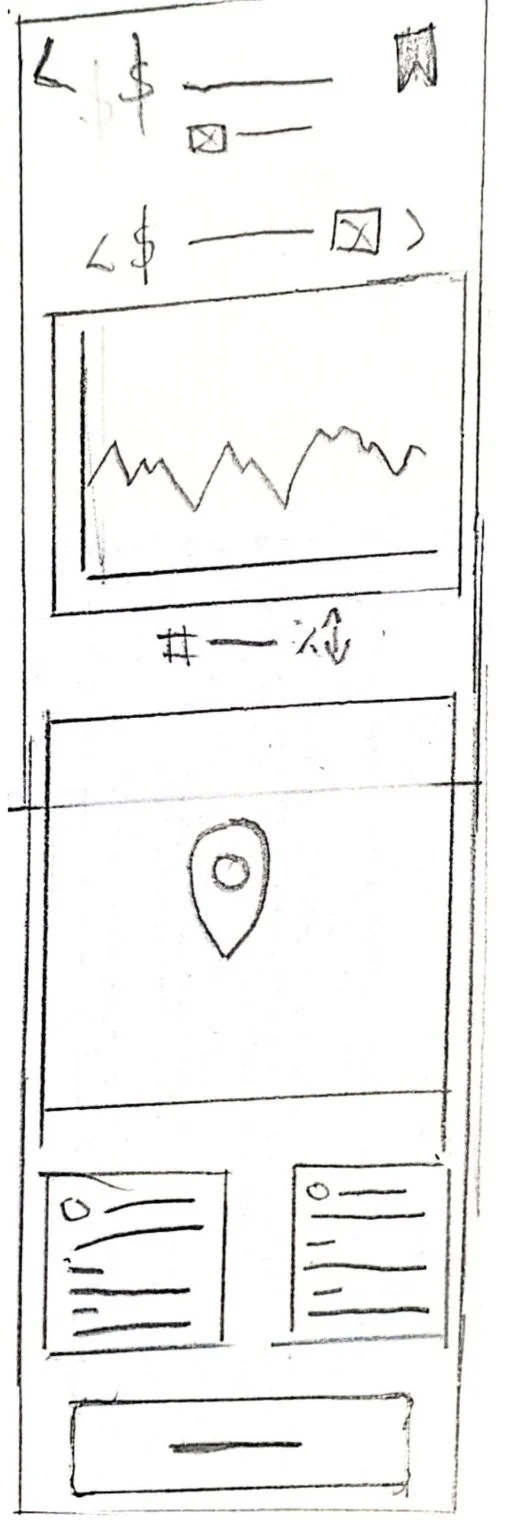
Paper Prototypes
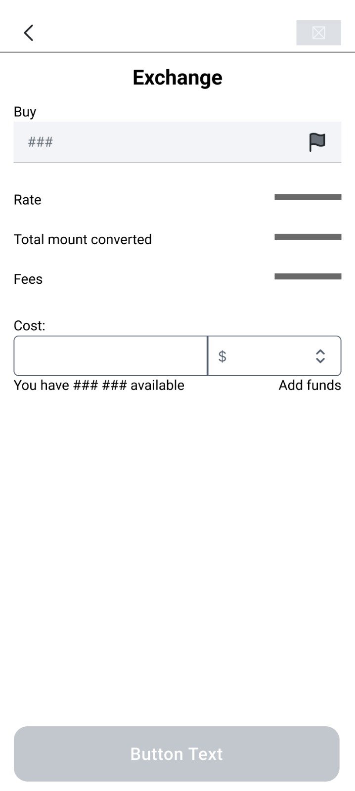
After coming up with some concepts for the flow and how it should be approached, the design for the home screen was focused on the need for quick glances in order to gain the most amount of valuable information without compromising legibility.
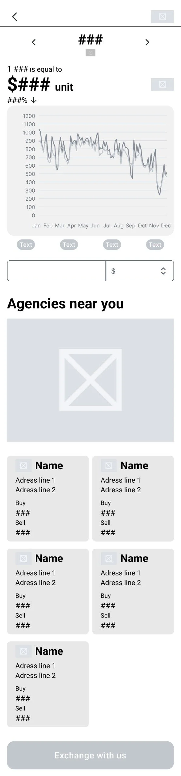
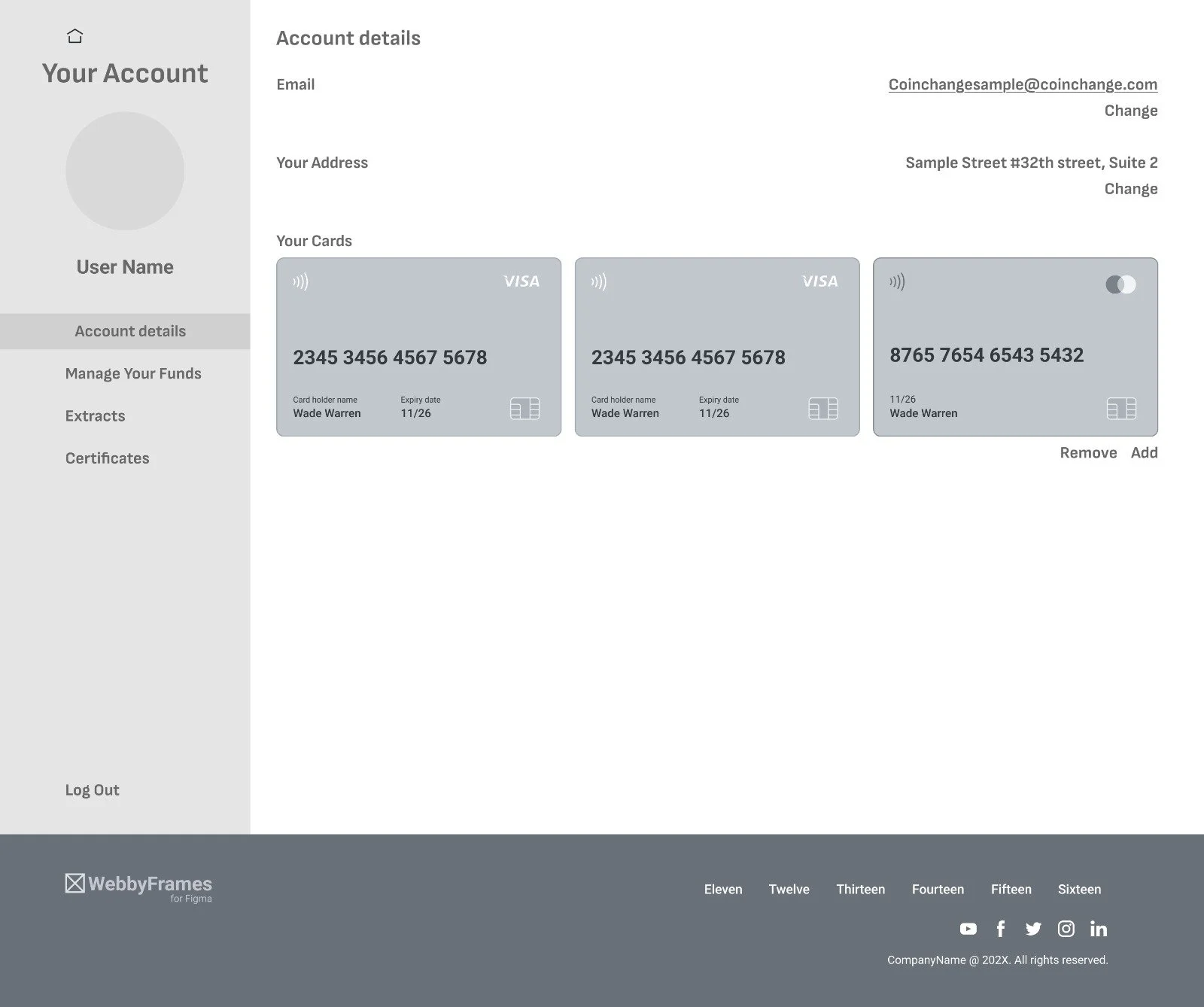
After refining the wireframes for the app version of CoinChange, a responsive web page was in order. The wireframes focused on the reorganization of the information and functionality present in the app, keeping important elements such as the INFO and FIND tabs . Both desktop and tablet size were also considered.
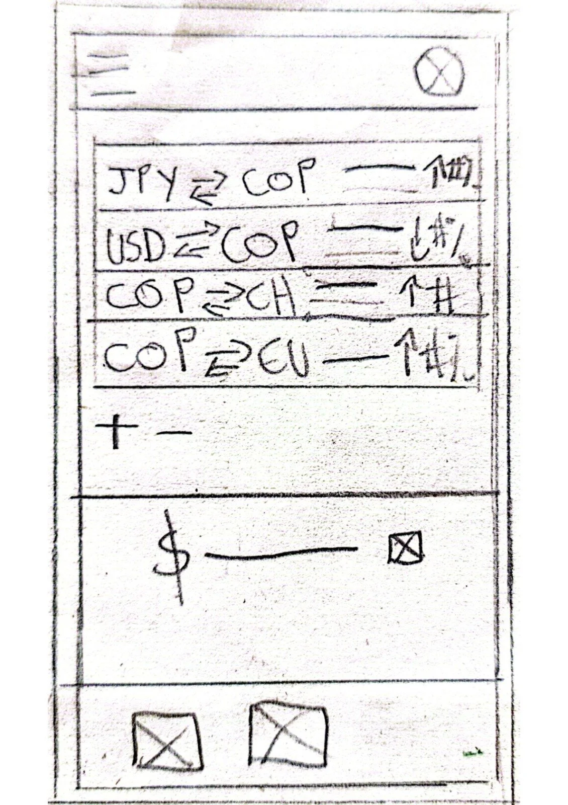
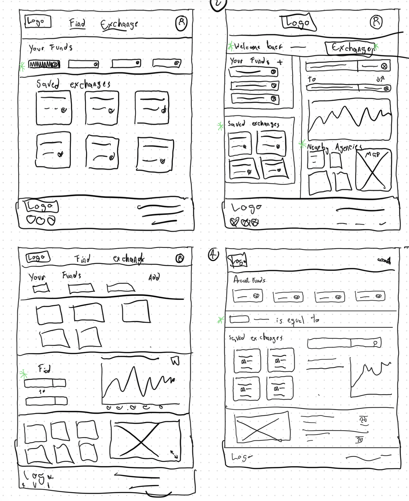
Wireframes
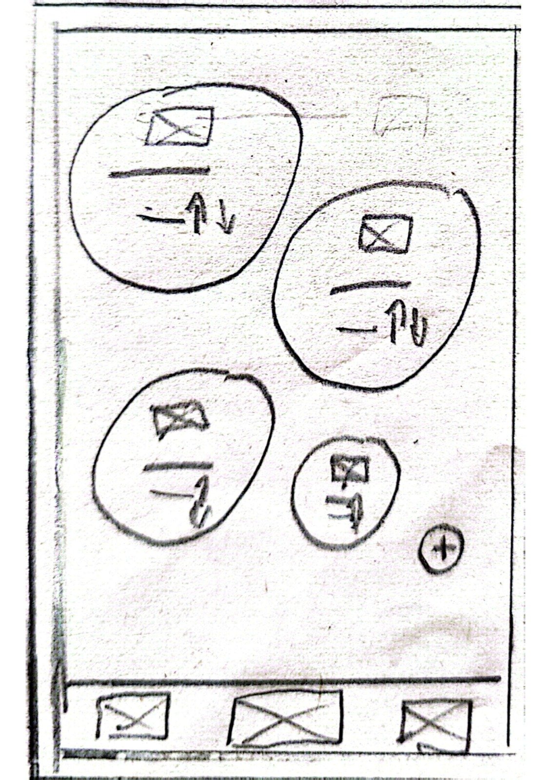
After choosing one of the paper wireframes as a main body, elements from the other paper wireframes were adapted and adjusted as needed while keeping in mind the tenets of presence of useful and readable information.
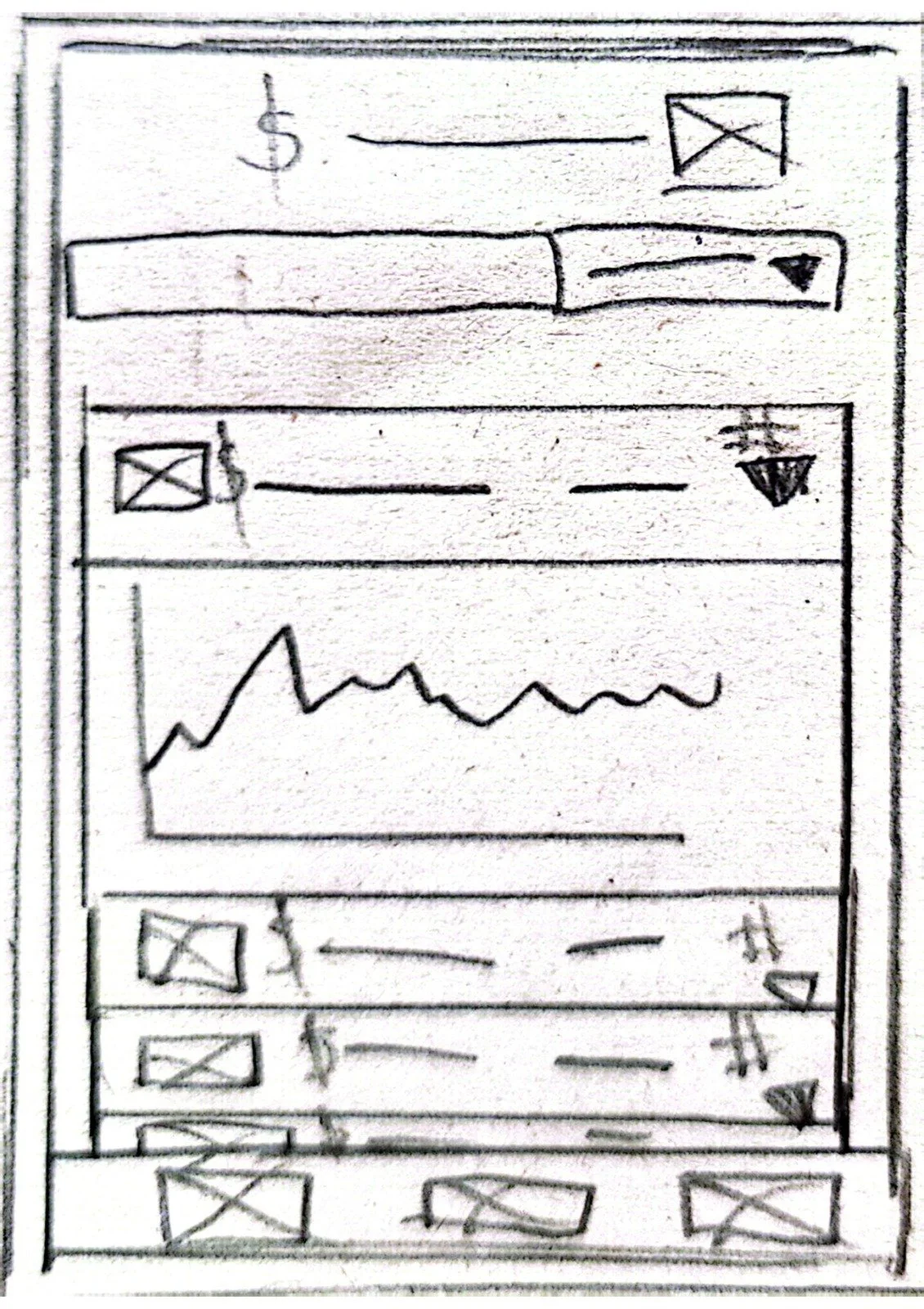
As for the CURRENCY DETAILS screen, when designing the paper and digital wireframes, great care was taken in order to not only decide what elements and information should be included, but also what approach should be used. Since this was the DETAILS, more technical information could be presented without feeling like overwhelming the user.
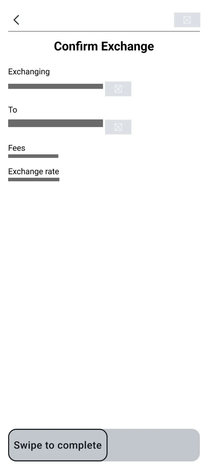
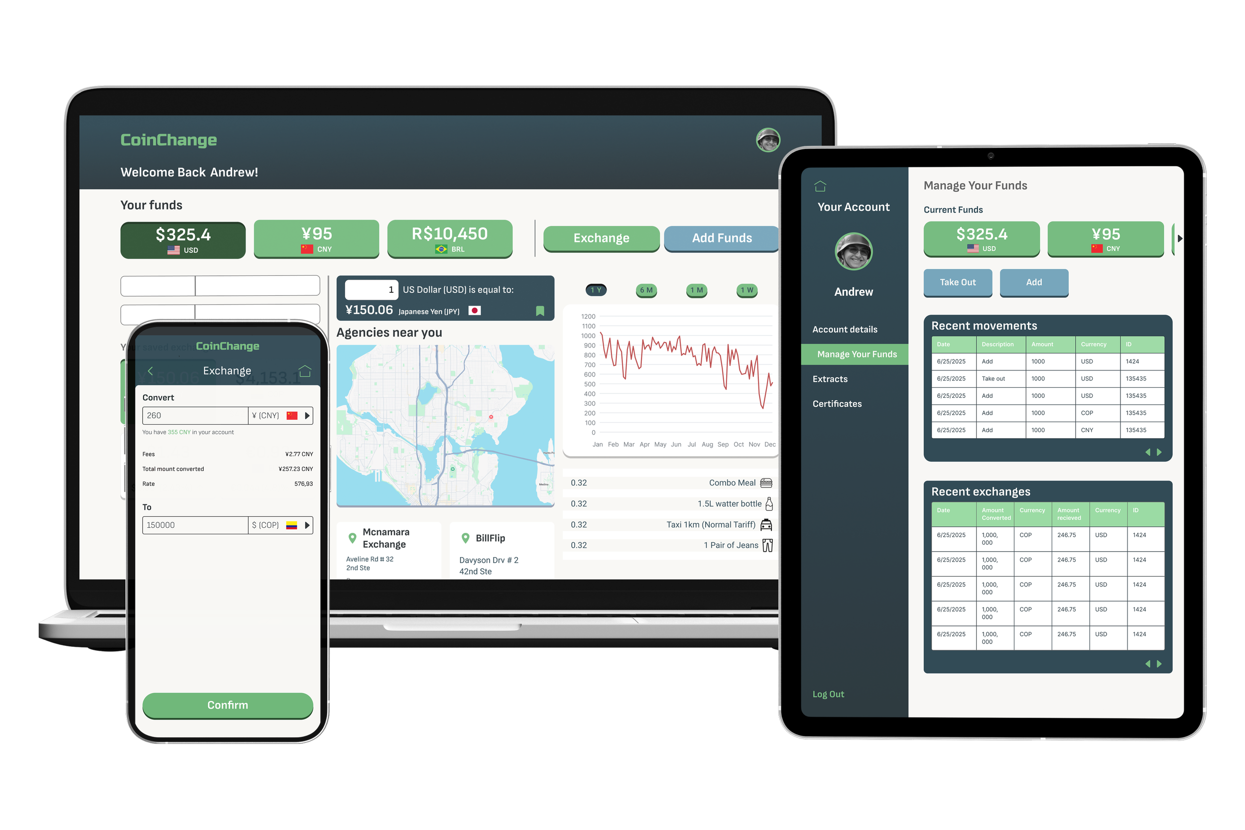
Final Designs
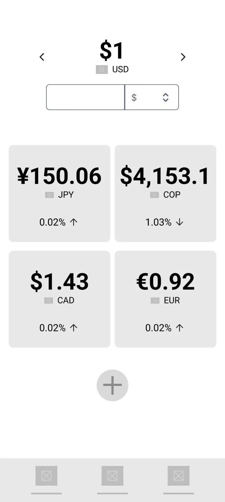
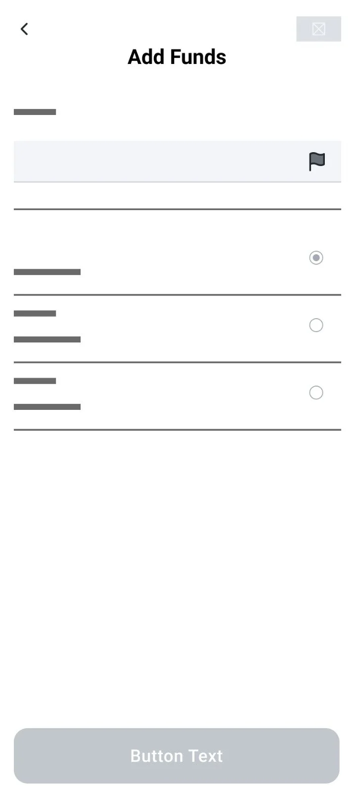
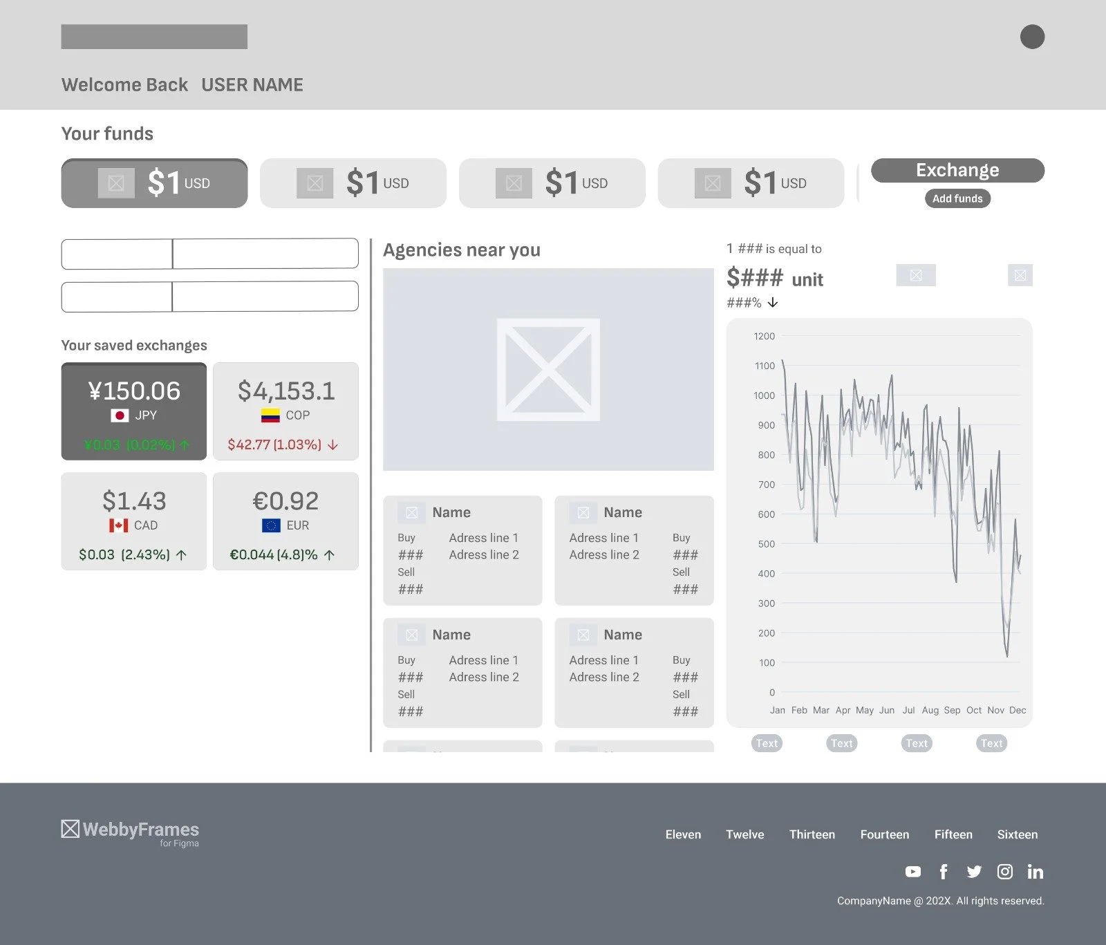
Based on the insights from the usability study, adjustments to the main flow were implemented in order to let users navigate more seamlessly. The currency selector under the CURRENT FUNDS carousel was exchanged with a space for the user to input numerical values that would reflect on the saved currencies based on the user’s current funds. Improved buttons and refined text sizes allowed for a clearer experience. An “ADD FUNDS” button was added. Finally, proportions were also adjusted.
The responsive website’s mockups incorporate the elements from the first wireframes, however, proportions were adjusted and a quick currency comparison tab was added in case the user decided to check info regarding current funds and saved exchanges.
Want to know more about this project?
Feel free to check any of the following links: