

Ribbon
//
Ribbon //
Ribbon is a specialized UX/UI solution designed to empower elderly patients with hearing impairments to manage their life-saving medications with complete independence. Recognizing that traditional auditory alarms are ineffective for the deaf community, Ribbon bridges the communication gap by synchronizing a medicine-tracking app with smart home devices and wearables. By complementing sound with haptic and visual cues, the platform ensures that users never miss a dose due to forgetfulness or inaccessible technology. This project explores the intersection of accessibility and IoT, transforming a potential barrier into a seamless, multi-sensory experience that preserves the dignity and autonomy of aging users.
Time: 2 months
//
Team: Solo
//
Google UX Design Certificate
UX Research
UX Design
Prototyping
FIgma
My Role:
The Challenge
Living with a hearing impairment presents significant hurdles for elderly individuals managing life-saving medications. While maintaining independence is a priority, human forgetfulness remains a risk that traditional digital alarms relying on inaccessible auditory cues fail to mitigate. Furthermore, analog pill organizers are passive, providing no proactive "nudge" to prevent missed doses. This creates a critical accessibility gap where neither standard notifications nor physical tools offer adequate security, leading to increased anxiety and a reliance on external help. Consequently, there is an urgent need for a solution that bridges digital tracking and physical reality through intuitive, multi-sensory interactions that empower the user within their own home.
Which is why it was asked:
How might we design an app that allows people with hearing disabilities to schedule alarms and keep track of the medications they might need to take on a constant basis, while synchronizing with other smart devices in order to raise the probability of the user, or a member of their community to notice said alarms?
The Solution
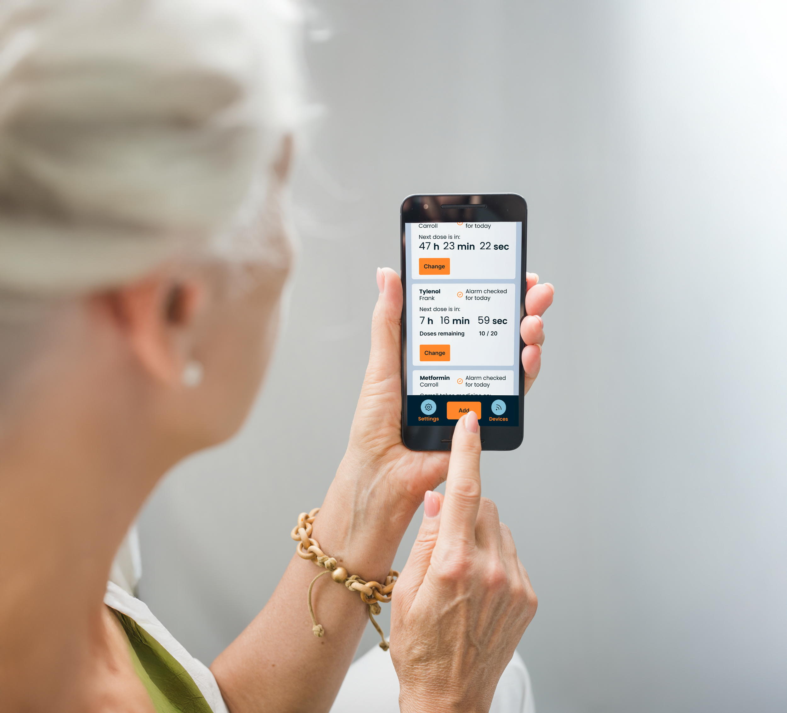
Ribbon is an app that tracks a user’s medicines and connects with other smart devices to let patients with hearing impairments remember when to take their medicines without the need of a secondary actor.
Research
After a series of user interviews, it was discovered that users with hearing loss struggle when remembering when they need to take their medicines unless they really pay attention due to not being able to use traditional alarms. The problem resolves itself when having the help of a dedicated nurse or a loved one, but some users value their independence and don’t want to feel like a burden to the people around them.
Regular alarms use sound as a way to alert users, however, people with hearing impairments can’t use these alarms due to their conditions
Patients might need great amounts of medicines and keeping track can be confusing and difficult, especially when at old age, the mind isn’t as sharp as it used to be
Patients value their independence, however, existing conditions can make simple tasks require the help of a loved one or a nurse, making users feel like a burden
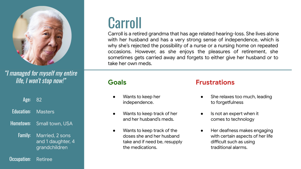
User Persona
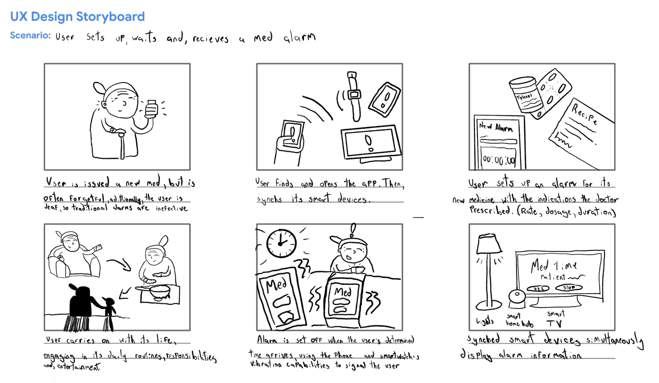
Storyboards
Paper Prototypes
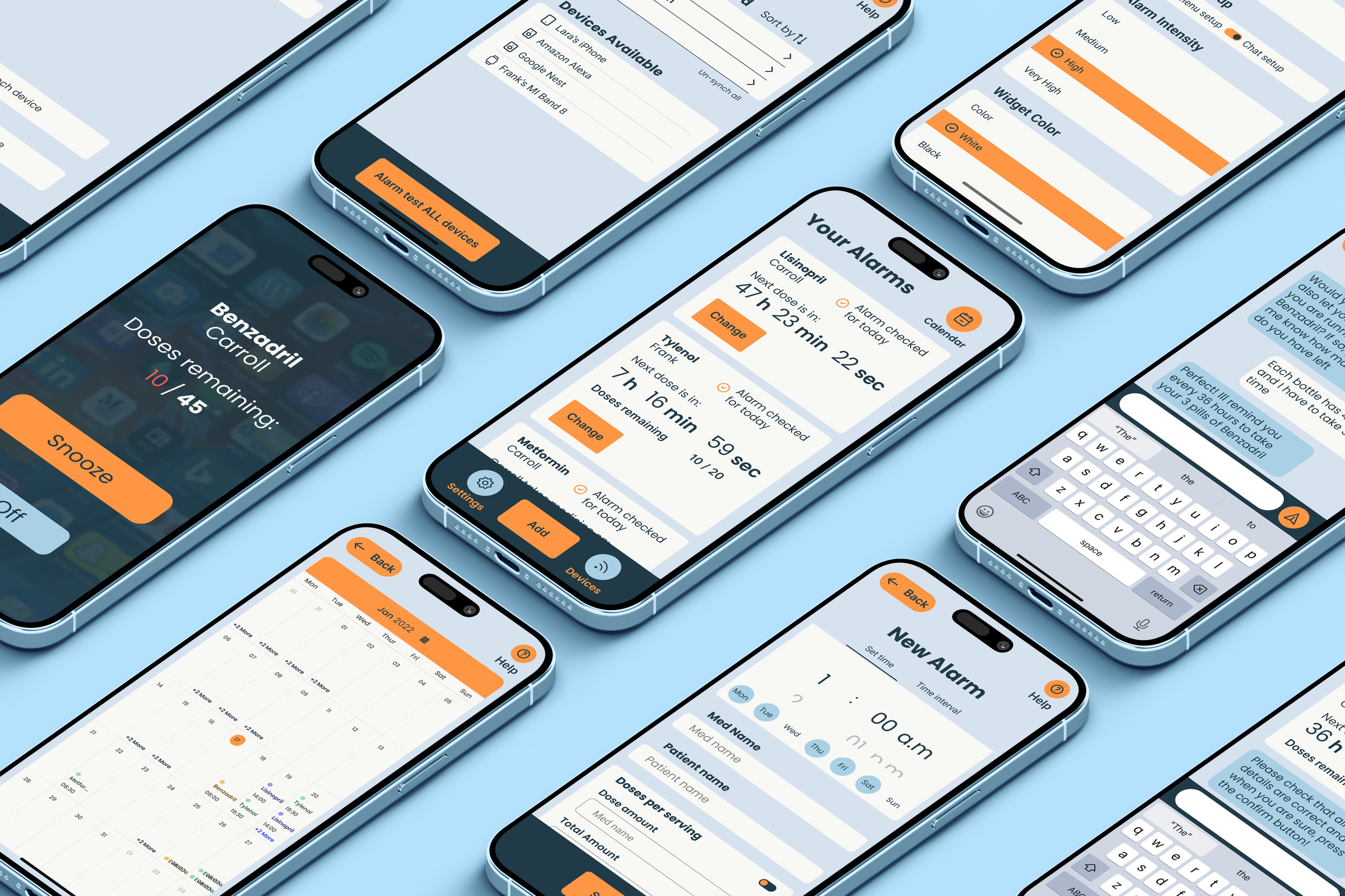
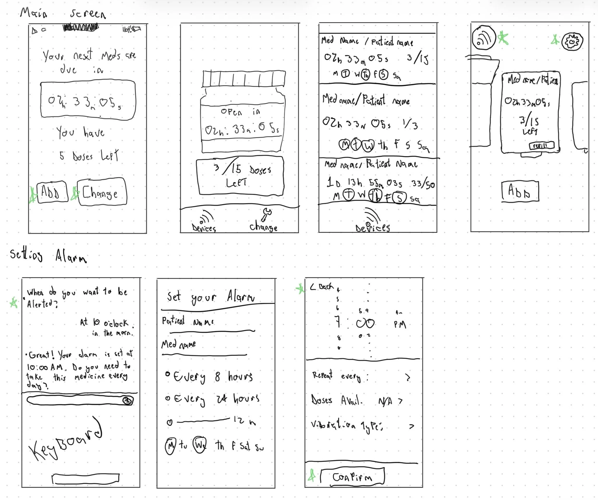
The home screen was designed with usability and information gathering in mind, displaying the different information that a user might need when checking the different alarms previously set up. Both a skeuomorphic approach and modern design were considered.
Wireframes
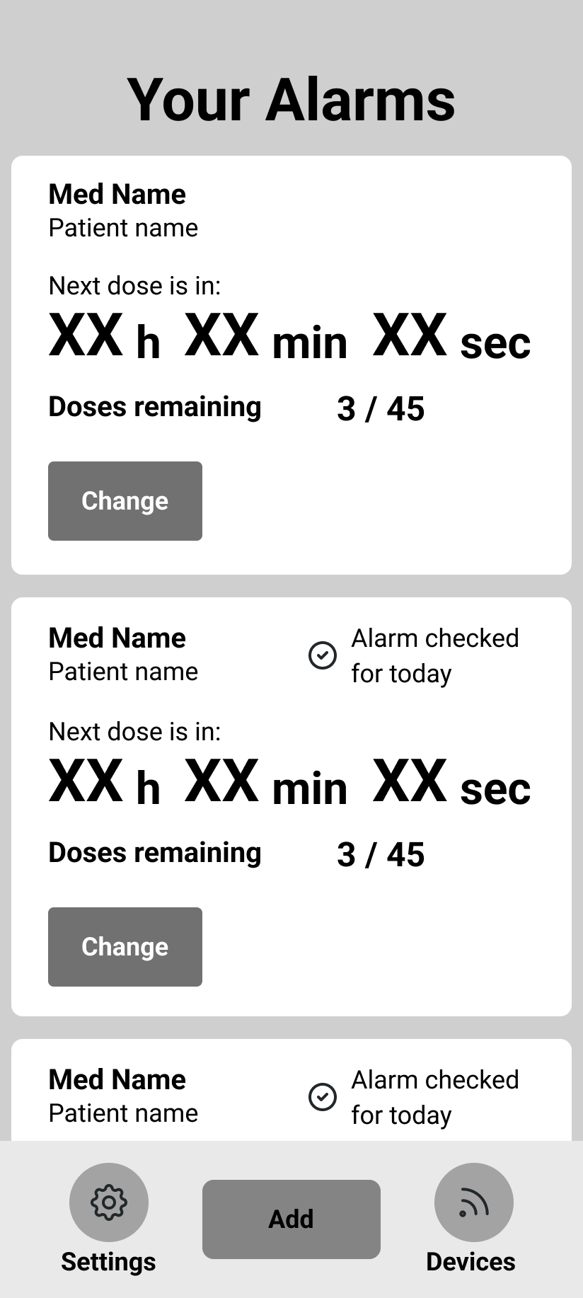
After choosing one of the paper wireframes as a main body, elements from the other paper wireframes were adapted and adjusted as needed while keeping in mind the need for useful and readable information.
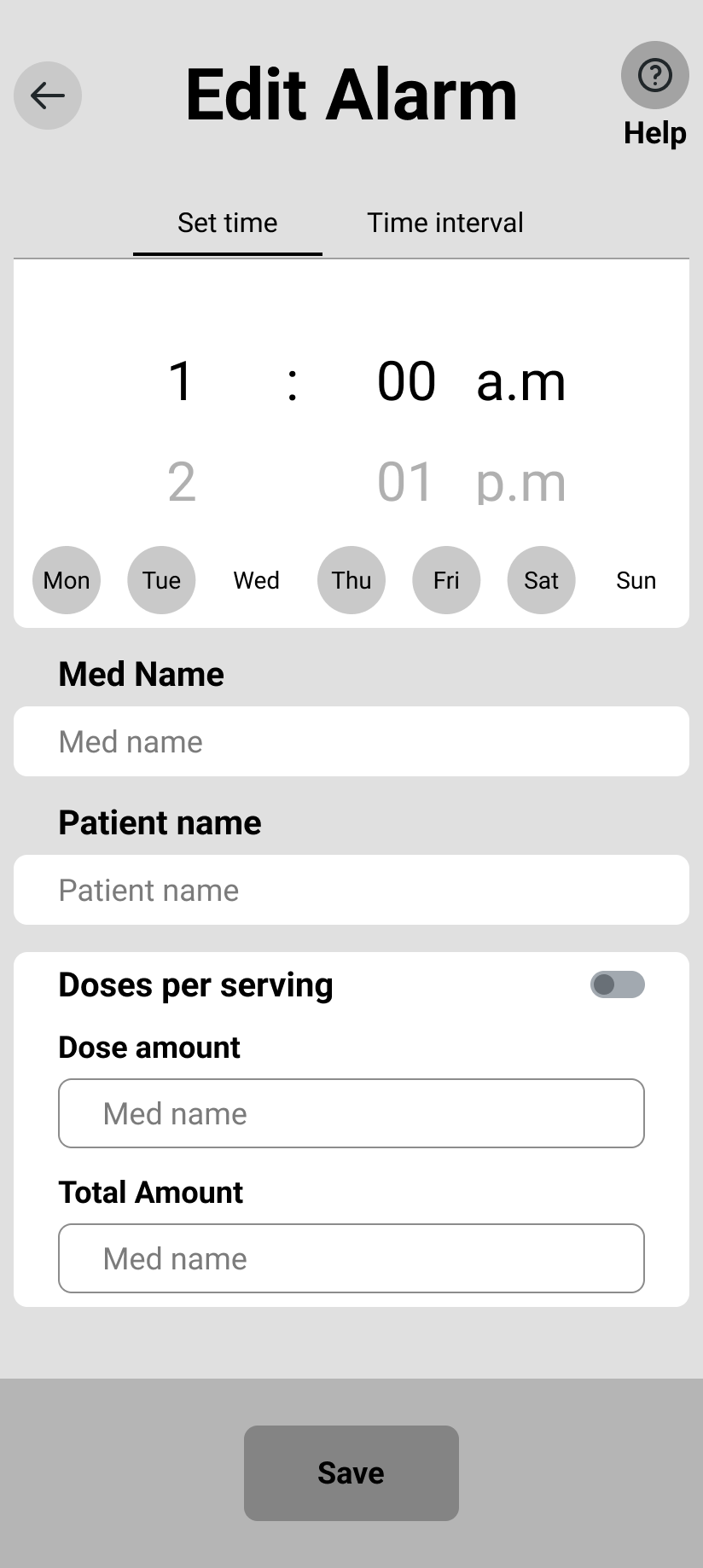
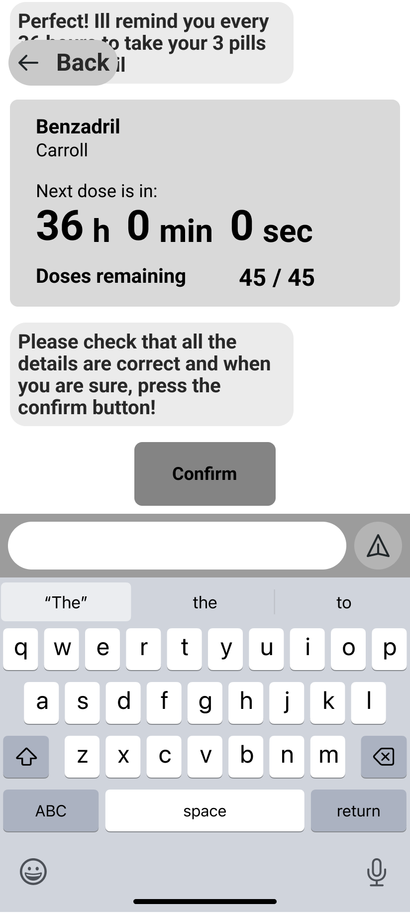
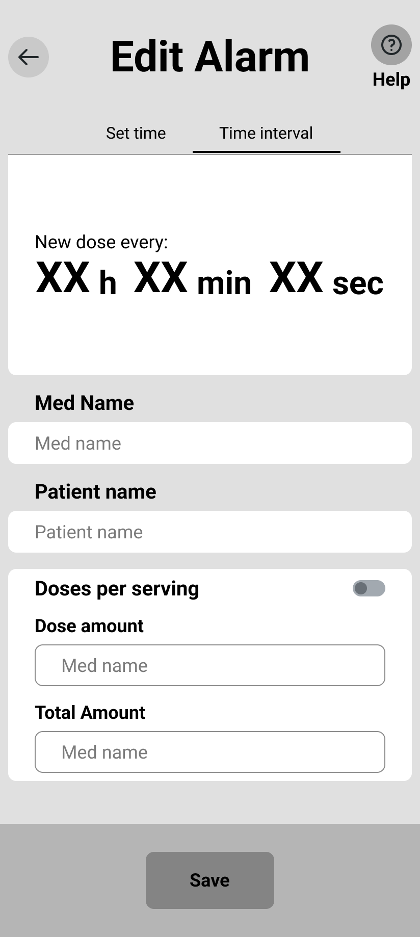
As for the ALARM SETUP screen, when designing the paper and digital wireframes, great care was taken in order to not only decide what elements and information should be included, but also what approach should be used. More technical information should be presented without feeling like overwhelming the user.
Final Designs
Based on the insights from the usability study, adjustments to the main flow were implemented in order to let users navigate more seamlessly. A Calendar page was added to the main menu so users could obtain a different perspective on how the different alarms and medications are spread throughout the month. Proportions were also adjusted for improved readability and better UX overall.
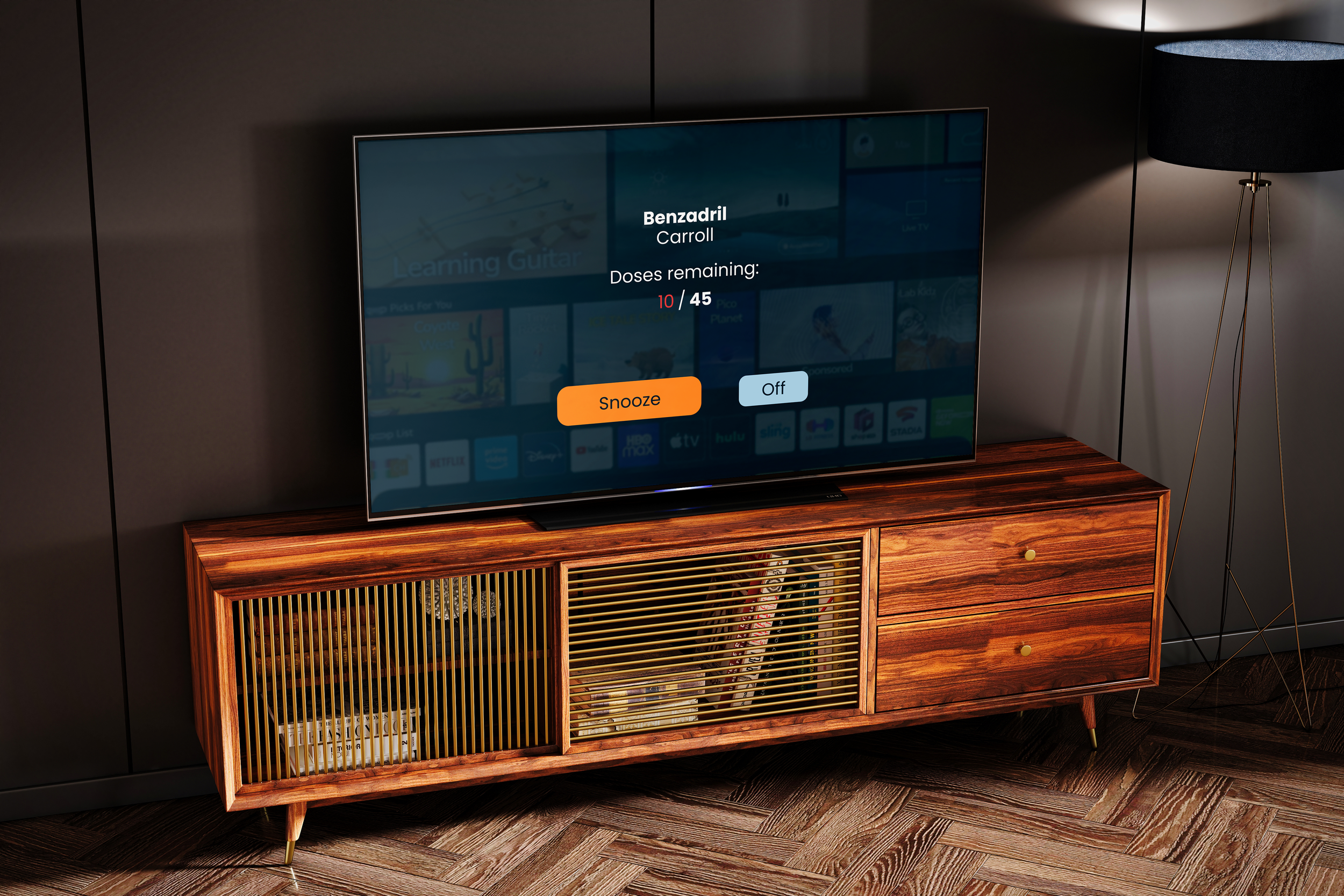
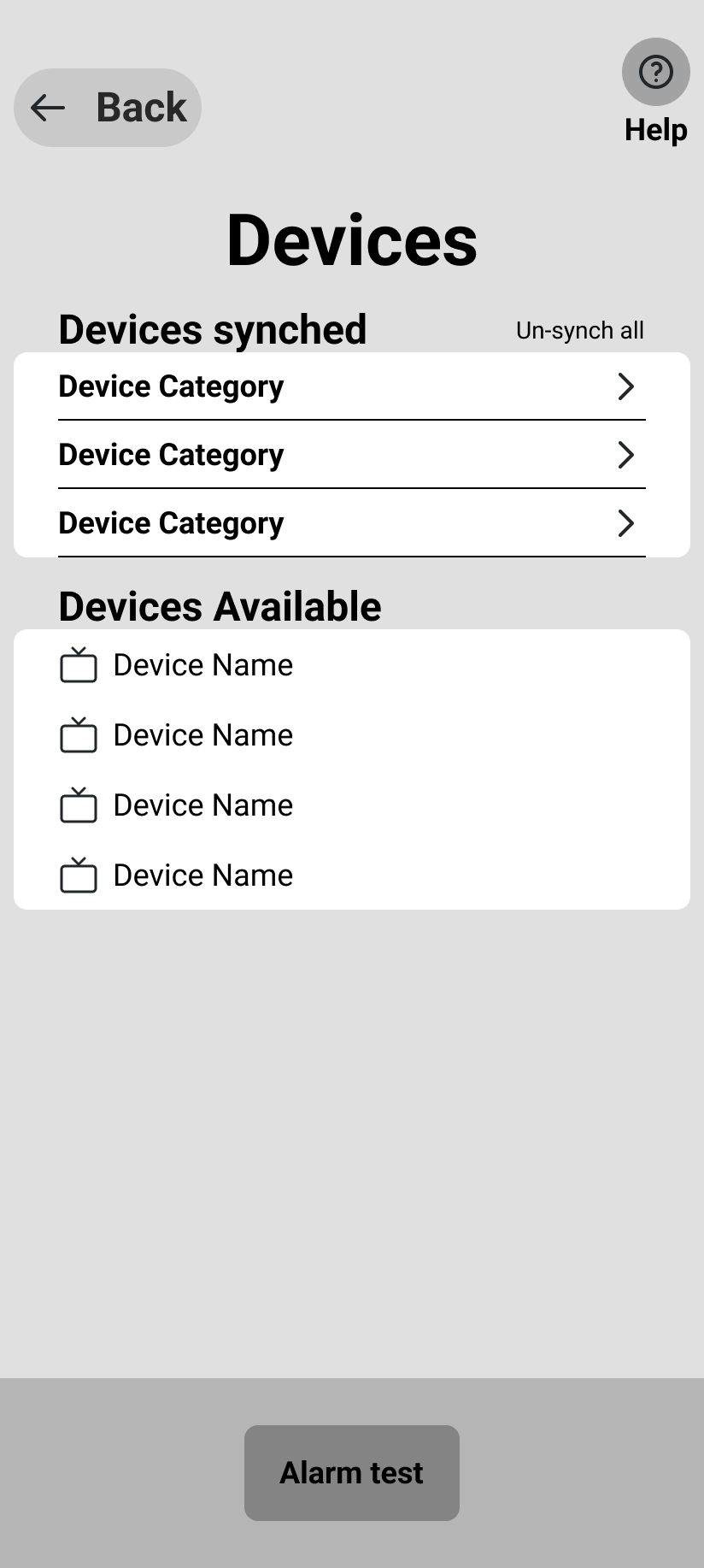
The app allows for different devices to synch simultaneously, creating a seamless ecosystem where the user takes all possible measures to remind itself and others around them when a medicine is due, regardless of any hearing condition, busy-work and without sacrificing the user’s independence.
Want to know more about this project?
Feel free to check any of the following links: